Exploring the LCh blend modes using a Wikipedia photograph of Kenyon Cox's portrait of Saint-Gaudens
This two-part tutorial was inspired by an email conversation with Americo. Part 1 (this page) takes the first step in analyzing Kenyon Cox's portrait of Saint-Gaudens, in which we learn that the Wikipedia photograph of Cox's portrait is not a very good photograph for learning anything useful about Cox's actual color palette. Part 2 will take a look at the Met Museum's presumably more colorimetrically accurate digitized version of Cox's portrait.
Written December 2016. Updated May 2018.
The inspiration for this tutorial, and how to follow along
Americo and I were having an email discussion about a portrait of the American sculptor Augustus Saint-Gaudens. Here's an excerpt from our conversation:
elle: I spent some time this morning rambling over the internet looking at art, starting from Fra_Angelico. Somehow I ended up at an article on Augustus Saint-Gaudens, which had a link to a portrait of Saint-Gaudens done by Kenyon Cox:There's a large original file, and looking at it, I thought the colors and shapes and edges were really quite beautiful. I was wondering what your reactions might be. americo: The portrait is a good exercise of a limited palette over ocher and probably some reddish... I don't remember all pigment names... but I think that exists red pigments with ascendance versus ocher tones. This work reminds me of some painting portraits by Anders Zorn, who also often used a very limited palette for figure and portrait paintings. Reading the Wikipedia Cox biography, I see that he was very interested in the line drawing and well finished before painting. So this approach, we can translate in the Tonal Composition that we have had the opportunity to talk and discuss between us. A good exercise could be to show a kind of reverse-painting of this subject, showing the colors, tonality, and major lines. Is obvious that the same approach could be used for any painting, also to Fauvists, for instance, but the concept here is, as we know that Cox has a great passion for the line and drawing... a good exercise would be to see whether with GIMP tools we can do an X-ray of the Cox painting.
This tutorial uses GIMP-2.10. Reading a tutorial on digital imaging is not a very useful thing to do unless you also follow along with an example file, replicating for yourself what the tutorial is trying to show. So I would recommend downloading the Wikipedia photograph of Kenyon Cox's portrait of Saint-Gaudens and following along with the various steps. In case you are worried, it's a public domain photograph, at least in the U.S.
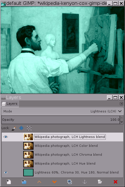
You'll need the base layer color to follow along with this tutorial, so here's a small version of the XCF layer stack that I used to make some of the screenshots in Section B below. You can get the base layer color from the bottom layer.
Once you've downloaded the Wikipedia photograph of Kenyon Cox's portrait of Saint-Gaudens, open it with default GIMP 2.10, promote the bit depth to 32-bit floating point, and set "Image/Precision" to "Perceptual gamma (sRGB)". For exploring the LCh blend modes, make a base layer of the same color as in the small version of the XCF file, make three additional copies of the Wikipedia photograph layer, and change the blend modes and layer labels to match the small version of the XCF file.
A brief overview of LCh and the LCh blend modes
In the LCh color space, any given color is broken down into three components:
- LCh Lightness
- LCh Chroma
- LCh hue
LCh is based on measurements of how people perceive differences in color:
The XYZ color space is based on experiments to determine how the average person (A.K.A. "standard observer") actually sees colors. The LAB color space is a perceptually uniform transform of the XYZ color space, and is based on experiments to determine how people perceive differences between colors. The LCh color space is a convenient polar transform of the LAB color space, allowing to specify colors by their Lightness, hue, and Chroma.
One practical application of LAB/LCh is quality control, allowing a quantitative answer to questions like "Does this fabric (or car paint batch or magazine print or etc) have perceptually the same colors as this other fabric (or car paint batch or magazine print or etc), or have the colors drifted far enough that people will notice the difference?" Another practical application is specifying and describing colors for paint pigments and such.
Well, that's more than enough generalities about LCh. The important thing is how useful the LCh blend modes might be in the digital darkroom/studio, and in this particular case, how useful they might be when analyzing an image's color palette.
Using a Wikipedia photograph of Kenyon Cox's portrait of Saint-Gaudens to explore the LCh blend modes
In GIMP-2.10, each LCh component can be used as a blend mode. There is a fourth LCh blend mode called "LCh Color", which is a combination of LCh Chroma and LCh hue, or alternatively "What's left when you abstract away the Lightness".
There are two slideshows below, which show the result of using the various LCh blend modes alone and in combination, and also show screenshots of the corresponding layer stacks so you can easily replicate the results in your own digital darkroom/studio.
Note: these screenshots were made using GIMP 2.9, before GIMP 2.10 was released. The LCh functionality hasn't changed since the screenshots were made. But the GIMP 2.10 user interface for layers has an extra drop-down menu allowing to choose between "Legacy" and "Default" blend modes. None of the LCh layer blend modes are available as "Legacy" blend modes. For other blend modes, use "Default" for this tutorial (and for all the tutorials on the Nine Degrees Below website).
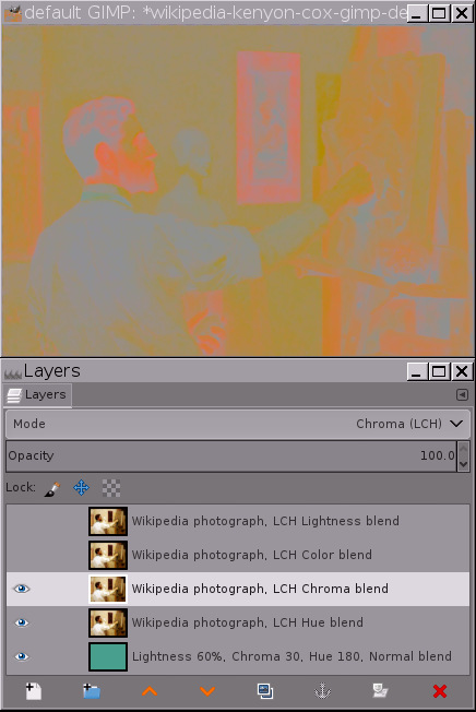
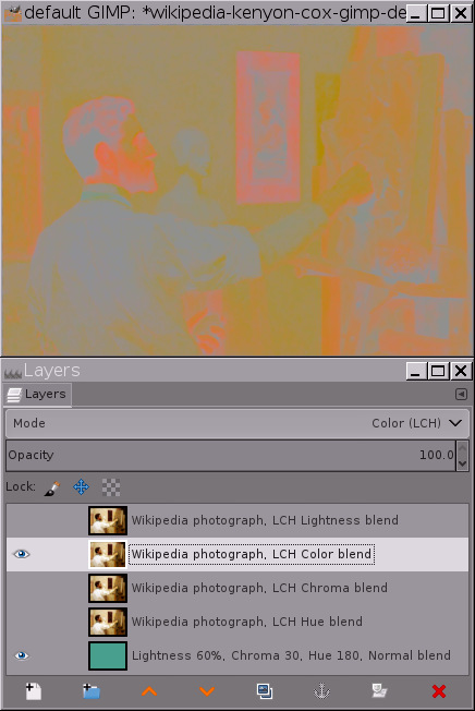
LCh Color (Chroma+hue)
The first slideshow shows the LCh Chroma, hue, and Color blend modes:


- Slide 1 reproduces the original image.
- Slide 2 shows the LCh hues for the Wikipedia photograph of Kenyon Cox's portrait of Saint-Gaudens. Notice the sprinkling of blue and green hue splotches. I'll just tell you up front that these hues are in the Wikipedia photograph, but almost certainly not in the original painting.
- Slide 3 is green because the base layer is green. If I had made the base layer blue, Slide 3 would have been blue. And so on.
- Slides 4 and 5 are identical: LCh Color is exactly equal to the result of combining LCh hue and Chroma.
- Slides 2 through 5 all have the same LCh Lightness value as the base layer. This means the LCh color space cleanly separates tonality ("Lightness") from color. You can prove this to yourself as follows:
- In the layer stack that you are hopefully using to follow along in this tutorial, make only the base layer and the LCh hue blend layer visible. Then make a "New from Visible" layer. Then desaturate the "New from Visible" layer to black and white using "Colors/desaturate/desaturate/Luminance". The RGB values will be (0.566863, 0.566863, 0.566863).
- Now make a copy of the base layer and hide all the other layers. Then desaturate the copy of the base layer, again using "Colors/desaturate/desaturate/Luminance". The RGB values will be (0.566863, 0.566863, 0.566863). Repeat for the other layers, and results will be the same.
LCh Lightness
The slideshow below examines the LCh Lightness blend mode, alone and in combination with the other LCh blend modes. All indicated blend modes are blended over the base layer:
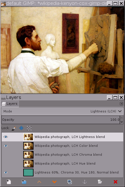

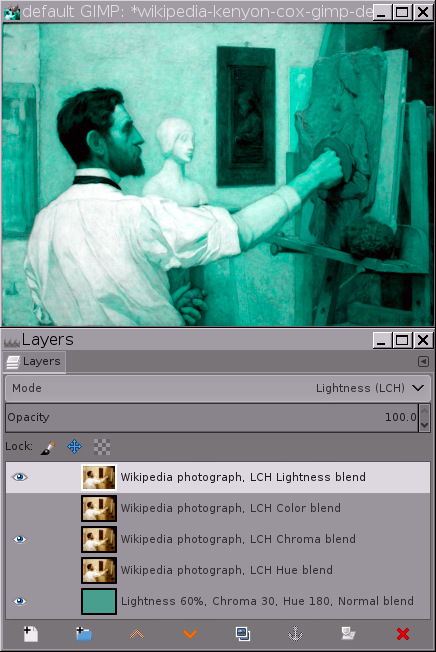
The slide labels are self-explanatory. Slide 2 again shows the odd sprinkling of various hues across the back the shirt. Slide 5 shows the Lightness of the image, keeping the color constant. Slide 5 is an example of a true "monotone" image, where the image's hue and Chroma are both constant (some of the resulting colors are out of gamut with respect to the sRGB color gamut — using a lower Chroma for the base layer would alleviate this problem).
Using the LCh color pickers to examine the color palette of Kenyon Cox's portrait of Saint-Gaudens
Having patiently worked our way through the various LCh blend modes, the next logical step is to take a close look at the LCh hues in the Wikipedia photograph of Kenyon Cox's portrait of Saint-Gaudens. This will prove to be instructive, but the only thing we actually learn is that the Wikipedia photograph is very far from being a colorimetrically accurate reproduction of the original painting.
Yellow and orange, and also green and blue?
The image shown below is the same as slide 2 in the LCh hue/Chroma/Color layer stack in Section B2.
As Americo said in our email conversation, the color palette for Kenyon Cox's portrait is predominantly in the ochre to red range. But what are we to make of the greens and blues found in the shadows (the tie, the back of the head, and below the outstretched hand) and the highlights (the back of the white shirt)? Did Cox mix two different tints of white paint on his palette for painting the back of the shirt? And did he also mix together some blue-toned and green-toned dark pigments for the shadows?
Improbable colors plus a physically impossible dynamic range
Without the benefit of Americo's comments on Cox's palette and painting style, I'm naive enough about artistic styles to think "Oh, maybe Cox decided that a dark green tie would look nice, and also maybe he painted blue and green shadows." But I found the radical hue changes in the highlights on the shirt to be quite puzzling.
So I went back to the Wikipedia page from which I downloaded the photograph of Cox's portrait and read the camera exif data, which revealed that the photograph was taken using a Canon Point and Shoot that was set to use Auto White Balance and the Standard Picture Style. This means the camera itself:
- Stretched the image's dynamic range.
- Applied a heavy "S-Curve" to the image to darken the shadows and brighten the highlights.
- Added saturation to make the colors more pleasing.
To further complicate the matter, we have no way to know how far off the Auto White Balance might have been. And we don't know what post-processing the photographer might have given the camera jpeg before uploading it to Wikipedia.
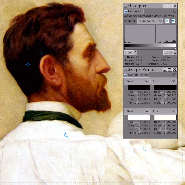
What we do know is that no physical painting made with real paints on a real canvas has a dynamic range that extends from solid black to solid white. And looking more closely at the photograph's tonal range — the "marching ant lines" in the image below indicate the portion of the image used to make the displayed histogram — indeed portions of the photograph are solid white and portions are solid black:
So the bad news is that unfortunately we haven't learned very much about Kenyon Cox's actual color palette. But we have excellent reasons to suspect that the original painting is considerably less colorful than the photograph, and we can attribute the technicolor hue splotches in the shadows and highlights to artifacts created by clipped and near-clipped channel values in the Wikipedia photograph. And perhaps we've learned to be suspicious of colors in digitized versions of paintings posted on the internet.
A more colorimetrically accurate reproduction of Cox's portrait of Saint-Gaudens
It would be nice to find another and hopefully more colorimetrically accurate reproduction of the original portrait. Which I did. Kenyon Cox's actual portrait of Saint-Gaudens currently belongs to the Metropolitan Museum of Art, which supplies a digital version of the painting that is accompanied by an OASC icon that clearly identifies the painting as both public domain and part of their Open Access for Scholarly Content, and also provides a link to a high resolution downloadable digitized version of the painting:

Well, the Met Museum reproduction of Kenyon Cox's portrait of Saint-Gaudens is certainly a lot less colorful than the Wikipedia photograph! And speaking frankly, I somewhat prefer the Wikipedia photograph. Sigh. For what it's worth I never claimed to have refined artistic sensibilities.
Summary and on to Part 2
Section B of this tutorial gives a short overview of the LCh color space. Sections C and D evaluate the Wikipedia photograph of Cox's portrait of Saint-Gaudens in terms of whether it's likely to be a colorimetrically accurate reproduction of the original painting, in the course of which we:
- Examined the results of applying the Wikipedia photograph of Cox's portrait over a solid green (actually cyan) base layer using the LCh "hue" blend modes.
The blue and green splotches — which have nothing at all to do with the color of the base layer — please experiment for yourself to confirm! — made it was pretty obvious that "something wasn't right" about the Wikipedia photograph of Cox's portrait of Saint Augustine: Painters who use predominantly ochre and earth-red palettes don't usually use blue and green pigments to produce cool-hued shadows and highlights.
- Examined the dynamic range of the Wikipedia photograph of Cox's portrait, and concluded that the photograph has a dynamic range that simply can't be produced using physical mediums such as paint on canvas.
- Took a quick look at the Metropolitan Museum digitized version of the same painting, which certainly is much less colorful than the Wikipedia photograph, and hopefully is a colorimetrically accurate representation of the original painting.
Part 2 of this tutorial (not yet written) will use GIMP 2.10 to explore the major lines, dynamic range, tonal distribution, and color palette of the Met Museum's digitized version of Cox's painting.