What type of monitor profile to make, plus test images for evaluating monitor profiles
This article is a summary of the results of two week's worth of experimenting with different ways to calibrate and profile a monitor. The article gives an overview of different types of monitor profiles, screenshots of using DisplayCAL to set the monitor's color temperature using the monitor's RGB White level controls, a step by step example showing how to use ArgyllCMS to make a calibration file and then use the calibration file to make a monitor profile, and test images for assessing the useability of the resulting monitor profile.
Written December 2017.
Goals when calibrating and profiling your monitor, vs what the monitor and graphics card can actually accomplish
Goals
When calibrating and profiling your monitor, it's important to consider exactly what your goals are, vs what the monitor and graphics card can actually accomplish. My goals when calibrating and profiling my monitor are:
- Accurate colors.
- Tonality that drops from monitor white to monitor black in a perceptually uniform manner.
- "Monitor white" (color temperature) that isn't green or magenta.
- Minimal or preferably no color casts up and down the gray axis.
- Images that display on the monitor with colors and tonality suitable for soft proofing to a printer.
Well, I suppose everyone who edits photographs or makes digital paintings has these same goals, but I never articulated them for myself until recently I realized that "something" was wrong with the colors I was seeing on my monitor.
What the monitor and graphics card can accomplish
My current monitor is a nine-year-old NEC LCD 2190UXI. For its time, this was an excellent monitor, it's been very reliable over the years, and I'm pretty sure it's got a few more years of service left in it. When we first purchased the monitor I did a lot of experimenting with various ways to make a monitor profile, and settled on not using a calibration file and instead profiling the monitor using its native white point and tone response curve. So until two weeks ago (I'm writing this article in late December 2017), the only calibration I've been doing is to set the monitor brightness to something like 64 cd/m^2.
On the one hand, profiling a monitor using its native color temperature and tone response curve does maximize the color gamut of the resulting monitor profile and minimizes tonal distortions up and down the gray axis. On the other hand, although display characteristics of LCD monitors change only very slowly, they do change. Over the last couple of years "something" has seemed increasingly wrong with the colors displayed on my monitor screen — "native monitor white" has acquired a slight green color cast. In other words, my old way of profiling just wasn't working any more. So this article is a summary of two week's worth of experimenting with different ways to calibrate and profile my nine-year-old monitor.
What's included in this article:
This article includes:
- An overview of what kinds of monitor profiles can be made using ArgyllCMS and DisplayCAL. DisplayCAL provides a user interface for ArgyllCMS, plus some very nice additional functionalities. Personally I'm more comfortable using ArgyllCMS to make monitor profiles, but if you are command-line averse, DisplayCAL is the way to go.
- An example showing how to use ArgyllCMS to check a monitor's current uncalibrated display characteristics. If you make and use a calibration file and then make a monitor profile that incorporates the calibration file, the resulting monitor profile will have the maximum color gamut and smoothest possible tonality changes if you target a "gamma" (tone response curve) and color temperature that's as close as possible to the monitor's uncalibrated "gamma" and color temperature.
- Screenshots showing how to use DisplayCAL to interactively modify a monitor's RGB White level controls (which not all monitors provide) to calibrate the monitor's color temperature to a specified temperature.
- Example commands for using ArgyllCMS to make a calibration file, and then use that calibration file to make a monitor profile.
- A set of test images that I found useful for evaluating the various profiles that I've made over the last couple of weeks.
I'd suggest looking at the test images before reading the rest of the article. I wish I had been using this set of test images all along — if I had, I might have realized a bit sooner that I needed to change my approach to calibrating and profiling my monitor.
This article was inspired by and draws on information and feedback from two pixls.us forum topics: Monitor profiles and deep shadow tonality and DisplayCAL is very slow, is this normal?. The information given below assumes that you already understand the difference between calibrating and profiling a monitor, and you have a working understanding of "color temperature" and a monitor's "color of white".
What kind of monitor profile to make?
This isn't a treatise on how to choose between the myriad options for using ArgyllCMS/DisplayCAL to calibrate and profile a monitor. But one critical decision is what kind of monitor profile to make. One option is to make a LAB LUT or XYX LUT profile. LUT profiles can very closely describe the monitor's display characteristics. But there are some problems when using LUT profiles as general purpose monitor profiles:
- As of December 2017, Firefox and Google Chrome can't interpret LAB LUT profiles, and if the system (or requested via browser settings) monitor profile is a LAB LUT profile, these browsers silently use sRGB as the monitor profile. Fortunately GIMP and probably most other image editors don't have any problems with using LAB LUT monitor profiles.
- Again as of December 2017, if the system or requested monitor profile is an XYZ LUT profile:
- RawTherapee, PhotoFlow, darktable, Krita, digiKam, and Geeqie (well, that's all the raw processors, image viewers and editors that I tried) — all display images exactly the same way, and the colors look correct.
- By comparison, Firefox produces less pronounced, somewhat lighter tonality in the darkest shadows, reducing detail to mud.
- Google Chrome displays totally broken colors.
- A minor point in theory, but a possible stumbling point in practice: LUT profiles require a source color gamut to create the various LUT profile tables, and the perceptual intent table in the resulting profile depends on both the monitor's color gamut and the color gamut of the source color space. I think DisplayCAL uses the sRGB color gamut. I don't have any clue what ArgyllCMS does — the documentation clearly tells how to specify a source color gamut but I couldn't figure out what happens if the user doesn't specify a source color gamut. In any event, the resulting profiles require that the user be able to figure out when to use relative colorimetric intent (the correct choice for general editing purposes) and when to use perceptual intent, and then make the appropriate configuration changes in the browser and in all the editing and viewing software the user might be using.
- XYZ and LAB LUT profiles can more accurately mirror a monitor's display characteristics than other types of profiles. But if you try to make a LUT profile using too few patches, it's easy to get very low deltas when all you've really accomplished is "over-fitting" the available information. So if you really want to make a LUT profile, be prepared to have your color measuring instrument read at least a thousand and maybe even a couple thousand patches.
Putting LUT profiles to one side, the other option is to make a matrix monitor profile, which in my opinion for many purposes and situations is the preferred type of monitor profile. If you choose to make a matrix monitor profile, there are four options:
- Three-channel shaper matrix, in which the R, G, and B tone response curves can vary independently — "shaper" just means the tone response curve can be any shape required to describe the monitor's response to changing RGB channel values. This type of profile can produce deltas almost as low as you can get using a LUT profile, and again, to avoid over-fitting the available data, it's preferable to read a thousand or more patches.
- Single channel shaper matrix, in which the R, G, and B channels all use the same curve. The deltas will be higher than with a three-channel shaper matrix.
- Three-channel gamma matrix, in which the R, G, and B tone response curves are constrained to be gamma curves, but each channel can have a different gamma curve. Deltas will be higher than with a shaper matrix profile, and this will be especially true in the shadow tonality.
- Single channel gamma matrix, in which the R, G, and B tone response curves are constrained to be the same gamma curve. Deltas will be even higher than with a three-channel gamma curve profile.
With LUT profiles, and also with three-channel shaper matrix and three-channel gamma matrix profiles, the fact that the R, G, and B channel can vary independently means it's possible that the profile will produce a gray axis that has more or less random green and magenta color casts. The question is whether these color casts can be minimized to the point of not being objectionable. ArgyllCMS provides many calibrating and profiling parameters that target the gray axis, and so this is an area where if color casts along the gray axis are a problem, then you just have to experiment to see what works for your monitor and your editing goals. In the Test Images section of this article I include some images specifically for checking to see how neutral the gray axis is.
Here are recommendations for a general-usage monitor profile. These recommendations are based on my very limited experience in profiling different types of displays, so take them for what they are worth:
- For a reasonably high quality display, if possible use a LUT profile, or else use a three-channel shaper matrix, because this type of matrix profile can very accurately describe the monitor's display characteristics. However, depending on your monitor and the other calibrating and profiling options you might specify, these types of profiles might cause more or less obvious color shifts up and down the gray axis.
For my NEC monitor, I get slight color shifts along the gray axis whether or not I make a calibration file to go along with a LUT or three-channel shaper matrix profile. I'm still experimenting with some of the calibrating and profiling parameters that are supposed to help deal with getting a neutral gray axis.
- If you also use a calibration file loaded into your video card (most people do), then a single channel shaper matrix also might be a good choice. A single channel shaper matrix combined with a suitable calibration file will eliminate color shifts along the gray axis and still maintain reasonably nice-looking colors, though the price will be higher max and average deltas compared to a three-channel shaper matrix profile.
For my own monitor and pending further testing, for now I'm using a single channel shaper matrix with a calibration file.
- For a poor quality display such as you might find on a low-end or older laptop, the three-channel gamma matrix profile — possibly even without using a calibration file — is probably your best option.
For my low-end Acer Vista-era laptop (inherited used, currently running Debian), I made a three-channel gamma matrix profile without using a calibration curve. Shaper matrix and LUT profiles of course can produce more accurate colors even on a very low-end display screen, but on my Acer laptop the price for increased accuracy was a severely reduced color gamut and crushed shadows, turning a poor display into an unusable display.
- I've never actually done this, but for displays that have a good sRGB preset, it might be worth experimenting with making and installing a suitable calibration file (targeting the sRGB TRC and 6500K for the Color Temperature), without actually profiling the calibrated monitor, and instead just use sRGB for the monitor profile.
Changing the monitor's "color of white"
Options for changing the monitor's "color of white"
Having realized that the native "monitor white" for my monitor was actually a fair bit on the green side of white, the first question is what to do about this situation. Here are the options:
- Leave the monitor controls alone and instead make and use a calibration file loaded into the video card LUTS to bring "monitor white" to some specified color temperature.
- Don't use a calibration file, and instead twiddle the RGB values provided in the monitor controls to set a custom "color of white" (not all monitors provide such controls).
- Twiddle the RGB values provided in the monitor controls to set a custom "color of white", and then also make and use a calibration file loaded into the video card LUTS. Unfortunately often the "color of black" for a monitor is fairly distant from the "color of white". But we really want the same "color of white" all the way up and down the gray axis, and a calibration file can at least partially accomplish this goal.
After experimenting with all three options listed above, I settled on the third option: Use the monitor controls to set a custom "color of white" and then make a calibration file to maintain the same "color of white" all the way down the gray axis (to the extent possible), and then make the monitor profile.
Choosing a target color temperature
Generally speaking, the closer the targeted color temperature is to the monitor's native (uncalibrated) "color of white", the easier it is to achieve that color temperature through calibration and profiling. So assuming you don't have an overriding reason to target some other color temperature, the first step is to measure the monitor's native "color of white". For my NEC monitor, here's what the ArgyllCMS dispcal utility reports (as an aside, my Spyder2 colorimeter is even older than my monitor, but still seems to be working just fine — I keep it stored away from light, vibrations, and extreme temperature and humidity fluctuations):
$ dispcal -v -yl -P 0.5,0.0,3 -R

Setting up the instrument
Instrument Type:   ColorVision Spyder2
Serial Number:     00674215
Hardware version:  0x0307
Place instrument on test window.
Hit Esc or Q to give up, any other key to continue:
patch 3 of 3
patch 17 of 17
Uncalibrated response:
Black level = 0.2412 cd/m^2
50%   level = 13.88 cd/m^2
White level = 65.85 cd/m^2
Aprox. gamma = 2.25
Contrast ratio = 273:1
White chromaticity coordinates 0.3387, 0.3617
White    Correlated Color Temperature = 5269K, DE 2K to locus =  9.8
White Correlated Daylight Temperature = 5272K, DE 2K to locus =  6.2
White        Visual Color Temperature = 5034K, DE 2K to locus =  9.4
White     Visual Daylight Temperature = 5139K, DE 2K to locus =  6.0
Effective Video LUT entry depth seems to be 8 bits
The instrument can be removed from the screen.
The "dispcal -R" command output provides a lot of useful information. I want to focus on the Color Temperature information. But there are several other bits of information that require a bit of commentary:
- The "White level" is set using the monitor's Brightness control and should be set to a value that makes for comfortable viewing, which is to say approximately as bright as the ambient light. Otherwise your eyes will get tired from having the monitor be too bright.
- The current uncalibrated "Black level" is 0.2412 cd/m^2. This is "in the neighborhood" of the value reported every time I've run the "dispcal -R" command over the last nine years.
- The "Aprox. gamma" is 2.25. This also is "in the neighborhood" of the value reported every time I've run the "discal -R" command over the last nine years.
- Unlike the Black level and gamma, over the last nine years the reported Color Temperature has fallen steadily from around 5900K to the current 5200K, and the "DE 2K to locus" values have increased considerably.
OK, focusing on the Color Temperature information, notice the lines that say "DE 2K to locus = 9.8 . . . 6.2 . . . 9.4 . . . 6.0" — these "DE" values are exactly why profiles for my NEC made using the uncalibrated (native) "monitor white" make neutral grays in color-managed applications look green instead of gray. After calibration these values should be much closer to zero, and in color-managed applications gray will look gray instead of green.
Also notice the Temperatures variously reported as 5269K, 5272K, 5034K, and 5139K. To minimize unwanted side-effects (smaller color gamut, less smooth tonal transitions), calibrate your monitor to a temperature close to what dispcal reports. I chose to twiddle my monitor's RGB controls to reach 5200K. Actually I used DisplayCAL instead of ArgyllCMS dispcal to guide the process of setting the monitor's RGB controls, as DisplayCAL has a really nice user interface for doing this:
Using DisplayCAL to twiddle the monitor RGB controls to set a custom monitor temperature
DisplayCAL is a user interface for ArgyllCMS with some very useful added capabilities. In particular, DisplayCAL has an easy-to-use interface for manipulating the monitor brightness and color temperature via the monitor controls, which I highly recommend using if you want to twiddle the monitor RGB values to set a custom color temperature:

A crop from a screenshot of the DisplayCAL user interface. Ignore the Settings line, which reflects experimenting with DisplayCAL to make the actual monitor profile. I decided that I prefer using ArgyllCMS for everything except modifying the actual monitor controls, but if you are "command line averse", you might prefer DisplayCAL.
Notice that "Interactive display adjustment" is checked, and the "Color Temperature" is set to 5200K, which is my "target" color temperature.
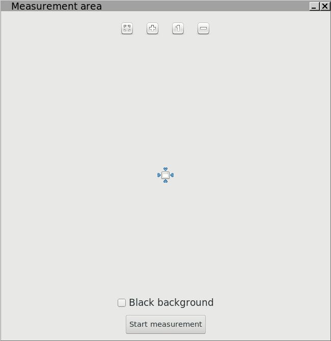
In the previous screenshot, clicking on "Calibrate and Profile" brings up a moveable, resizeable window that shows you where to place your color measuring instrument. When you've settled on a window size and placement, put the color measuring instrument in the middle and click "Start measurement".

Clicking "Start measurement" brings up the "Interactive display adjustment" dialog.
At first the dialog will tell you it's not ready. Be patient. It may take awhile, but eventually the "Interactive display adjustment" dialog will indicate that it's ready. And then you can press the "Start measurement" button to tell DisplayCAL to start taking screen measurements.

The goal is change the monitor's Red, Green, and Blue "White level" controls (Step 5 below shows a photograph of the relevant NEC monitor controls), until the red, green, and blue bars in DisplayCAL line up.
Before modifying my NEC monitor's Red, Green, and Blue "White level" controls, the DisplayCAL green bar was much longer than the red and blue bars. You want to get the DisplayCAL bars to line up closely enough to produce the green checkmark that lets you know the color temperature target has been reached. Ideally all three bars should be the same length.
While you have DisplayCAL running, it's a good idea to also adjust your monitor's brightness to a level suitable for the brightness of the ambient lighting. I usually aim for something like 60-70cd/m^2. Some people use 100-120cd/m^2, but given the intensity of the ambient light illuminating my work area, this is far too bright for comfortable viewing.

This is a photograph of the NEC monitor control interface for setting a custom color temperature using the Red, Green, and Blue "White level" controls.
Originally the Red, Green, and Blue levels were all set to 255. The custom monitor color temperature is set by changing these values, and changing any of these values is almost immediately reflected in the changing bar lengths in the DisplayCAL "Interactive display adjustment" dialog.
As you can see, I had to substantially lower the Green level to achieve the DisplayCAL target 5200K color temperature, and I had to lower the Blue level just a little bit.
Making a calibration file and using it to profile the monitor
When using ArgyllCMS at the command line, the easiest approach to making a profile that uses a calibration file is to follow the instructions in Adjusting, calibrating and profiling in one step. At least for my monitor, this "one step" approach produces a monitor profile that crushes shadow tonality. It also provides for less control over the resulting monitor profile. So instead I'm following the Profiling in several steps procedure:
- If a monitor profile is already installed, then uninstall the currently installed monitor profile: "dispwin -U path-and-file-name-of-currently-installed-profile.icc".
- Clear the current calibration from the video LUTS: "dispwin -c". This command actually loads a linear calibration file into the video LUTS.
- As shown above, check the current state of the uncalibrated monitor, and then use DisplayCAL's "Interactive display adjustment" to make any desired changes to the monitor's Brightness and RGB White level controls.
- Use dispcal to make a calibration file.
Here's the specific parameters I used to make my last set of test monitor profiles:
$ dispcal -v -yl -P 0.5,0.0,3 -m -g2.2 -t5200 -qm base-name-of-calibration-file
When the calibration is done, dispcal saves to disk a calibration file named "base-name-of-calibration-file.cal". The "dispcal" command automatically adds the correct file extension.
I used the following file name for the monitor calibration file that I made on December 23, 2017: "nec-20171223-g22-t5200-R255-G239-B250-qm.cal". Here's the calibration file naming convention that I'm using, along with an explanation of why I chose the particular dispcal parameters:
- "nec" is just to indicate that the calibration file is for my NEC monitor (there's only one NEC monitor in the house).
- "20171223" is the date (YYYYMMDD) that I made the calibration file.
- "-g2.2" is the "Aprox. gamma" reported when I used "dispcal -R" to check the uncalibrated display characteristics. So of course I would change this parameter in the command line and in the output file name to cohere with whatever dispcal reports about my monitor in its uncalibrated state.
In case you have some other "gamma" target in mind besides whatever is reported by "dispcal -R", dispcal also allows to target the sRGB TRC ("-gs"), the LAB L TRC (-gl), and whatever gamma value you might specify.
- As discussed above, I targeted 5200K ("-t5200") as the calibrated color temperature. If I needed or wanted to calibrate the monitor's color temperature to some other value, then of course "-t5200" would be replaced with that other temperature, in both the command line and in the output file name.
- As discussed above, I used DisplayCal's very nice "Interactive display adjustment" to set my monitor's RGB White level to "R=255, G=239, B=250". So I also put these values in the output file name.
- dispcal allows to ask for low ("-ql"), medium ("-qm"), or high ("-qh") quality calibrations. So putting "-qm" in the file name lets me know that I asked for a medium quality calibration.
A low-quality calibration takes a relatively short length of time to make, a medium quality takes longer, and a high quality calibration takes a very long time, up to several hours. In general and despite what you might assume, there is no guarantee that a higher quality calibration file will produce a better final profile than a lower quality calibration file. So despite the time-consuming nature of making a calibration file, this is an area where experimenting is the best thing to do.
I don't include the first part of the dispcal command — "dispcal -v -m -yl -P 0.5,0.0,3" — in the output file name, but here's what these parameters do:
- "-v" specifies how verbose to be when sending information to the terminal during the calibrating procedure.
- "-m" says to skip over the monitor calibration steps (it's easier to use DisplayCAL to set the desired monitor color temperature and brightness).
- "-yl" tells dispcal that the monitor is an LCD monitor rather than a CRT.
- "-P 0.5,0.0,3" tells dispcal where on the screen to display the color patches and also how large to make the color patches.
The ArgyllCMS "dispcal" documentation has very helpful explanations of all of the above and quite a few more available colprof parameters.
- Load the calibration file into the video LUTS: "dispwin name-of-cal-file.cal". For this example case the exact command is "dispwin nec-20171223-g22-t5200-R255-G239-B250-qm.cal".
- Make a list of patches to be read (targen) using these parameters:
$ targen -v -d3 -G -e30 -B30 -f836 -w -W nec-20171223-d3-G-e30-B30-f836-w-W
This command executes relatively quickly and outputs the file "nec-20171223-d3-G-e30-B30-f836-w-W.ti1". As you can see, I included the date and the targen parameters in the targen output file name.
The "-f836" parameter tells targen that you want 836 patches in the list of patches to be read. I'll leave it up to you to read through the targen documentation to figure out what the other parameters do. There are several interesting parameters that require first making a preliminary profile, including parameters that allow you to specify how much emphasis to give to the gray axis and to darker colors vs lighter colors.
- Use dispread and your color measuring instrument to read the patches listed in the ti1 file produced by targen, using the "-k" parameter to tell dispread to take the calibration file into account:
$ dispread -v -yl -P 0.5,0.0,3 -k nec-20171223-g22-t5200-R255-G239-B250-qm.cal nec-20171223-d3-G-e30-B30-f836-w-W

Number of patches = 836
Setting up the instrument
Instrument Type:   ColorVision Spyder2
Serial Number:     00674215
Hardware version:  0x0307
Place instrument on test window.
Hit Esc or Q to give up, any other key to continue:
patch 836 of 836
The instrument can be removed from the screen.
Written 'nec-20171223-d3-G-e30-B30-f836-w-W.ti3'
Reading the patches is quite a bit faster than making the calibration file, though it's still fairly time-consuming. It's worth experimenting a bit to see how many patches you want to use when making your monitor profile. I usually ask targen (previous step) to output a ti3 file with something like 1200 patches to be read. For experimenting with different ways to make calibration files and monitor profiles, I've been using 500 patches.
- Once you have made and loaded a calibration file (*.cal), used targen to output a list of patches to be read (*.ti1), and have read these patches using dispread (*.ti3), then you can experiment to your heart's content with using colprof to make different kinds of monitor profiles. The following command uses colprof to make a single-channel shaper matrix profile:
$ colprof -v -A"NEC" -M"LCD2190UXI" -C"Public Domain" -qh -aS -D"nec-20171223-g22-t5200-R255-G239-B250-qm-cal-qh-aS.icc" -O"nec-20171223-g22-t5200-R255-G239-B250-qm-cal-qh-aS.icc" nec-20171223-G-e30-B30-w-W

No of test patches = 836
Omitted 0 zero measurements
Find white & black points
Initial white point = 0.957947 0.995321 0.861072
Creating matrix...
 100%
Matrix = 0.397926 0.173427 0.063454
         0.175901 0.419793 0.019101
         -0.009089 0.035508 0.430457
Creating matrix and single gamma curve...
 100%
Matrix = 0.548923 0.278425 0.138438
         0.278686 0.638166 0.082000
         0.015623 0.069270 0.738812
Gamma = 2.192415
Creating matrix and single shaper curve...
 100%
Matrix = 0.555453 0.280593 0.135089
         0.279211 0.644866 0.076302
         0.011702 0.067228 0.751660
Input offset  = 0.002210
Output offset = 0.003437
gamma = 2.237206
1 harmonics = -0.020930
2 harmonics = 0.029553
3 harmonics = -0.018256
4 harmonics = -0.009167
5 harmonics = 0.005538
6 harmonics = 0.006077
7 harmonics = -0.000056
8 harmonics = 0.002760
9 harmonics = 0.005849
10 harmonics = 0.000307
11 harmonics = -0.004158
Doing White point fine tune:
Before fine tune, rel WP = XYZ 0.97113477 1.00037899 0.83058927, Lab 100.014652 1.132190 -0.433042
After fine tune, rel WP = XYZ 0.96420288 1.00000000 0.82490540, Lab 100.000000 0.000000 -0.000000
                 abs WP = XYZ 0.96485397 0.99568854 0.86702576, Lab 99.833050 0.832130 -3.635552
Black point XYZ = 0.00329183 0.00339703 0.00295807, Lab = 3.068528 0.066242 -0.294219
Scaling White Point by 1.004330 to make Y = 1.0
Display Luminance = 67.207290
White point XYZ = 0.969032 1.000000 0.870780
Black point XYZ = 0.003306 0.003412 0.002971
Done gamma/shaper and matrix creation
Profile done
Profile check complete, peak err = 6.492601, avg err = 1.069426, RMS = 1.240692
As with the output from the dispcal and targen commands, my naming convention shows some of the colprof parameters that I used to make the profile. The only colprof parameters in the example command that affect the functionality of the resulting monitor profile are "-qh" (specifies the profile quality) and "-aS" (specifies to make a single channel shaper matrix profile).
It's well worth consulting the colprof documentation to explore what colprof parameters are available and what each parameter does.
- Install the profile: "dispwin -I nec-20171223-g22-t5200-R255-G239-B250-qm-cal-qh-aS.icc".
As already noted, once you have a calibration file and the ti3 file from the dispread command, it's easy to experiment with the various colprof parameters to see which type of profile will work best with your specific monitor. So using the same ti3 file, I used colprof to make six monitor profiles, keeping the other colprof parameters constant and only changing the type of profile requested: XYZ LUT, LAB LUT, three-channel shaper, single channel shaper, three-channel gamma, and single channel gamma.
After evaluating the various monitor profiles that you can make using colprof and your current calibration and "ti3" file, you may decide that what you really need is more color patches, in which case you have to go back to the "targen" step. And you may realize you want to try a different calibration file, in which case you pretty much need to start over from scratch.
Some notes on making monitor profiles
The naming conventions I used for the "cal", "ti1", "ti3", and "icc" files created by the above profile-making process allow me to see which parameters were used for each step of the calibrating and profiling process, just by looking at the dates for the various files. If I make more than one "calibration+profile" in a day, I add "-HHMM" after "YYYYMMDD".
When taking readings from the display, you really do need to allow the monitor to warm up for at least an hour (depending on the monitor, maybe even longer), and as the DisplayCAL website recommends, it seems like a good idea to let the color measuring instrument rest on the monitor for a half-hour before you start making the readings.
It's important to keep the ambient light constant while taking the readings. For me, this means making profiles after dark because the window light to the left of my monitor changes during the day: Depending on the weather, sometimes the window light changes from one minute to minute (as Mark Twain said, if you don't like the weather in New England, just wait a few minutes), and it's never constant for more than an hour or so.
It's important to keep glare off the front of the monitor, of course while you edit images, but especially when profiling the monitor. For me the easiest way to do this is to profile the monitor at night with the room lights off. A "lights out" situation also results in the "dispcal -R" command reading darker black levels and a higher contrast ratio, compared to readings taken in the day. But when I edit, I don't sit in total darkness. So I decided to compromise and keep the light level in the room lower than normal, but not totally dark.
Test images for evaluating monitor profiles
The test images should be viewed using a browser or color-managed image editor that allows to specify using relative colorimetric intent (not perceptual!) and not using black point compensation.
For viewing in an image editor, I recommend high bit depth GIMP 2.9 because GIMP's color management settings are very easy to change. Unlike some image editors, you don't have to restart GIMP before the new color management settings take effect.
Firefox is the only browser I know of that allows to properly configure color management settings, except Firefox hasn't supported black point compensation since version 3.5, and as noted below, there are serious issues even with Firefox, if you try to use a LUT profile. For following this article, use the Firefox settings shown in Viewing Photographs on the Web. One thing not noted in Viewing Photographs on the Web is that if you leave the monitor profile field blank, Firefox (hopefully) will use the system monitor profile. Also, every time you change Firefox's color management settings and/or your installed monitor profile, it's necessary to close and reopen Firefox before the changes take effect.
Step wedges

In this test image, the top rows show perceptually uniform tonality changes, and the bottom rows show radiometric tonality changes. For evaluating monitor profiles, the top rows are more useful than the bottom rows. The top rows can be used to help evaluate these aspects of your monitor profile:
- In a browser or an image editor, you can see any color casts that might be caused by the monitor profile. But hopefully the image is the same shade of neutral gray (no color shifts) up and down the step wedges.
The "Step wedges" image was very helpful in evaluating my two week's worth of test monitor profiles.
 As illustrated by the inset screenshot (to which I've added saturation to make the color casts very obvious), most of the profiles that I made showed slight color casts up and down the grayscale (what should be neutral gray instead showed variously hued color casts). These color casts were usually more obvious in the darker midtones, and sometimes very obvious towards the very darkest tonalities my monitor can display.
 - In a browser or an image editor, the "Step wedges" image also can be used to visually evaluate the uniformity with which the monitor profile causes shadow tonality to drop from maximum brightness down to the minimum black your calibrated and profiled monitor is capable of displaying. Especially look at the fourth row, which shows blocks incrementing from L=0 to L=100, with the Lightness being "+1 higher" for each block.
- If you open the "Step wedges" image in an image editor that allows you to easily click black point compensation on and off (I recommend high bit depth GIMP), then this image allows you to see how radically using or not using black point compensation affects shadow tonality, with "how radically" depending on the monitor's actual black point and state of calibration and also on the monitor profile you are using.
Perceptually uniform gradients

This test image can be used exactly the same way as the previous test image, except it shows gradients instead of blocks. All statements below assume you are using using relative colorimetric intent with black point compensation disabled:
- The top row and bottom right gradients run from LCH L=0 to LCH L=100.
- On most properly calibrated and profiled monitors, whether in a properly color managed browser or in a color-managed image editor, at some point you shouldn't be able to see any tonality changes in the deep shadows even if you zoom in (unless your monitor's Black level really is zero; see the next Section for other possibilities). Of course in the radial gradients, the tonality stops changing at the radius of the gradient, so the lower left and right corners shouldn't show any tonality changes.
- Hopefully the colors all look neutral (no color casts). Most of the test profiles that I made showed a fairly obvious band of dark saturated green just before crossing over to solid black.
- The second row and bottom left gradients run run from L=5 to L=100. On most of today's properly calibrated and profile monitors, hopefully you can see a uniform tonality change at least all the way down to approximately L=5. Some profiled and calibrated monitors can show tonalities below L=5 (depending on the monitor, the calibration, and the profile), and some stop showing tonality changes quite a bit above L=5. Most of my test profiles still showed greenish discoloration in the deep shadows, even when limiting the darkest dark to L=5.
- You might or might not see evidence of "faux posterization" in the gradients. By "faux" I mean this posterization isn't in the actual image file even at 8-bit integer precision. While experimenting with various approaches to calibrating and profiling my monitor, I tentatively concluded that this "faux posterization" seems to be caused by a discrepancy between the monitor profile's TRC and the image color space TRC, as the obviousness and also the precise location of the "lines of posterization" varies according to the amount of the discrepancy. I'm guessing the bit depth of the Video card LUTS also plays a role. I have no idea whether this "faux posterization" is visible on any monitor other than my own.
Two photographs with overall dark tonality

If you've read descriptions of Ansel Adams' "Zones", the lightest foliage in this image is intended to fall in Zone 2, "textured black; the darkest part of the image in which slight detail is recorded", with the darkest portions of the foliage falling in Zone 1, "Near black, with slight tonality but no texture". These two "Zone descriptions" describe my intention for the image. They also describe what I see on my monitor when the image is opened in GIMP, when using the LUT and also the shaper matrix profiles, using the following color management settings: color management is enabled, black point compensation is disabled, and the rendering intent is set to relative colorimetric. But with these same color management settings, some of the test monitor profiles I've made over the last week crush most of the foliage to solid black, and a couple of the test monitor profiles turn what should be rich dark shadows to a muddy lighter color with a reddish hue.
When viewing the image in Firefox, when using the shaper matrix profiles the image matches what GIMP shows using the same profiles. But when using the XYZ LUT profile, Firefox shows flattened "fuzzed out" deep shadow detail where GIMP still shows distinct tonal variations.

The low tonality in this image makes it extremely sensitive to how different monitor profiles display deep shadow tonality. To me it looks more or less "as intended" when I use one of the LUT profiles made using the procedure outline in Section D above, a bit too light and not saturated enough when using the single channel shaper matrix, and both too light and too desaturated when using the gamma matrix profiles (well, when using the gamma matrix profiles the image looks just plain awful).
In addition to the tonality shifting around in various unpleasant ways, the apparent hues in the sky and foliage also shift around, with the single channel shaper matrix profile making the sky look a slight bit too purple (not a problem with other "sky" images when viewed using the single channel shaper matrix profile) and the foliage too desaturated.
I bet this image would be difficult to print, and at this point I don't have a clue what it "really" looks like.
It's important to use a wide variety of of your own images when evaluating monitor profiles, to make sure you've checked for things like color shifts for specific hue ranges, color shifts along the gray axis for both high and low tonality images, shadow posterization, shadow tonality, and changes in apparent saturation. For example, especially when using the XYZ LUT profile (and to a lesser extent using the LAB LUT profile) that I made in Section D above, Tulips in a bud vase shows posterization in the lower right corner just above the table cloth, and Glass shadows shows posterization in the brighter portions of the blue cup's "shadow" (projection of light through the cup onto the table top).
Twenty-five gray patches on a black background, with sRGB channel values from (1,1,1) to (25,25,25)

Like all the images on this page, this image is in the sRGB color space. For purposes of this article, the correct way to view this image is in a properly color-managed image editor, raw processor, or image viewer, using Relative Colorimetric Intent, with Black Point Compensation disabled.
For reasons already mentioned above, Firefox and Google Chrome (and probably just about all other web browsers) are ruled out for anyone using a LUT monitor profile.
How many patches can you see?
Over on the pixls.us forum, I asked people how many patches they could see on their monitors, and responses ranged from a low of 14 to a high of 25. Some people were using calibrated and profiled monitors, and some were using unprofiled monitors, presumably with sRGB as the monitor profile. Some people specified which browser or image viewer they were using, and some did not. Nobody specified what rendering intent was being used and whether black point compensation was being used, but that's probably because I didn't ask.
This amount of variation in "how many patches can be seen" surprised me quite a lot. So I checked three very different display devices in our home, none of which have been calibrated or profiled:
- A low-end Windows 10 laptop: I see all 25 patches, and the background is obviously gray instead of black. Pictures look very washed out on this display.
- A wide screen LCD TV: I see all 25 patches, and the background looks black.
- The LCD that came with a small HP Pavilion desktop, running OpenSUSE Tumbleweed: I see 22 patches, and the background looks black. Pictures look pretty good though shadow tonality could be a bit darker.
FWIW, on my own monitor:
- If I clear the calibration from the video LUTS and use sRGB as the monitor profile, then I see 20 patches.
- The test monitor profiles I've made over the last two weeks variously allow me to see anywhere from 25 patches (when a three-channel gamma matrix profile) all the way down to only 5 patches (most profiles made by asking for a one-step calibration and profile, using the colprof "-o" option).
- Using the XYZ and LAB LUT profiles made using the procedure on this page, I see 11 patches. Using the shaper matrix profiles, I see 14 to 15 patches, and using the gamma matrix profiles, I see all 25 patches. As explained below, "only 11 patches" seems to be the best reflection of my monitor's actual calibrated Black level.
Why does it matter how many patches you see?
Assuming you are viewing the image using either Firefox or high bit depth GIMP, using relative colorimetric intent and with black point compensation disabled (three other ways to view the image are described below), the first question is "How is the number of patches that you see in "Twenty-five gray patches" relevant to calibrating and profiling your monitor?
The answer is simple: Two of the most important edits — perhaps even the most important edits — that you can make to an image are setting the black point and the rate at which shadow tonality falls off to black. What we see on the screen is how we determine where to set the black point and how rapidly to make the shadow tonality fall off to black. For example:
- If you can see 22 patches in the "Twenty-five gray patches" image on your monitor, you'll probably make the shadow tonality of any given image considerably darker (as measured by the number) than you would if you could only see 15 patches.
- And if you can see only 15 patches on your own monitor, an image edited by someone who can see 22 patches probably will look considerably darker on your monitor (will have more contrast, deeper shadows, and also more saturation), than it does on the other person's monitor. Conversely, images edited on monitors showing only see 15 patches will probably look too light in the shadows when viewed on a monitor that shows 22 patches.
In the two bullet points above, notice the weasel word "probably". Unquestionably the parameters used to make your monitor profile affect how many patches you can see. In addition, I rather suspect that the contrast ratio and black level of your calibrated and profiled monitor both make a fair amount of difference in how many patches you can seen. If the contrast ratio on my monitor were higher and the black level were lower, then probably I'd see more patches, even if I used the exact same process for calibrating my monitor and making the monitor profile. However, in this case "more patches" wouldn't mean all the patches were being made lighter by the monitor profile, but rather than the monitor's calibrated Black level was darker, hence make it possible to see darker patches against the solid black background.
So how many patches should you be able to see?
Let's assume you are looking at the "Twenty-five patches" image on a monitor that's been calibrated and profiled, and you are using a properly color-managed image editor or viewer (Firefox doesn't count, at least not if you are using a LUT profile). Is there a "correct" number of patches that you "should" be able to see? The answer is no, simply because there are too many variables that affect how many patches that can be seen by any given person, using any given monitor, in any given state of calibration, with any given monitor profile made using whatever set of profiling options, as viewed under any given ambient lighting conditions, for any given editing or viewing goal.
I can't tell you how many patches you should be able to to see on your monitor. But I can explain why "11 to 15 patches" is an acceptable number of visible patches on my specific NEC monitor, given my specific editing goals. The explanation requires comparing the Lightness values for the 25 color patches to the LAB Lightness value for "monitor black":
LAB is a perceptually uniform color space, with LCH being a straightforward polar transform of LAB, allowing to specify "Chroma" (distance from A=B=0) and "Hue" (angle from the positive A axis) instead of "A" and "B". In theory, a "just noticeable difference in LAB/LCH Lightness" should correspond to a delta of 1.0 between one Lightness value and the next, though in practice most people can discern smaller differences under controlled viewing conditions.
The box below shows the LAB Lightness value for the patches in the "Twenty-five patches" image. Notice the first patch only has a delta of 0.3 from the black background.
Background: R=G=B=0   L=0.0

First (top) row:
Patch  1:  R=G=B=1    L=0.3 #first patch I can see using my gamma matrix profiles
Patch  2:  R=G=B=2    L=0.5
Patch  3:  R=G=B=3    L=0.8
Patch  4:  R=G=B=4    L=1.1 #first patch with a delta of "1" from the background
Patch  5:  R=G=B=5    L=1.4

Second row:
Patch  6:  R=G=B=6    L=1.6
Patch  7:  R=G=B=7    L=1.9
Patch  8:  R=G=B=8    L=2.2
Patch  9:  R=G=B=9    L=2.5
Patch 10:  R=G=B=10   L=2.7

Third row:
Patch 11:  R=G=B=11   L=3.0
Patch 12:  R=G=B=12   L=3.3 #first patch I can see using my single channel shaper matrix profile
Patch 13:  R=G=B=13   L=3.6 #might be the patch closest to my monitor's calibrated Black level
Patch 14:  R=G=B=14   L=4.0
Patch 15:  R=G=B=15   L=4.3 #first patch I can see using my LUT profiles

Fourth row:
Patch 16:  R=G=B=16   L=4.7
Patch 17:  R=G=B=17   L=5.1
Patch 18:  R=G=B=18   L=5.5
Patch 19:  R=G=B=19   L=5.9
Patch 20:  R=G=B=20   L=6.3

Fifth (bottom) row:
Patch 21:  R=G=B=21   L=6.8
Patch 22:  R=G=B=22   L=7.2
Patch 23:  R=G=B=23   L=7.7
Patch 24:  R=G=B=24   L=8.2
Patch 25:  R=G=B=25   L=8.8
The ArgyllCMS xicclu utility allows to determine LAB values for "monitor black", which is the darkest dark color a monitor can display given its current "state of calibration plus monitor profile". "Monitor black" is the color that corresponds in "monitor space" (the color space defined by the monitor profile) to the RGB color R=G=B=0.
When properly made, a LAB or XYZ lut profile better reflects the monitor's actual ability to display colors than other types of profiles. Here's the xicclu command to show the LAB Lightness for R=G=B=0 for an XYZ LUT profile made using the procedure in Section D above:
xicclu -ir -pL nec-20171223-g22-t5200-R255-G239-B250-qm-cal-qh-ax.icc
0.000000 0.000000 0.000000 [RGB] -> Lut -> 3.692217 2.231284 1.352858 [LCh]
OK, comparing the Lightness of "monitor black" to the the Lightness values for the 25 patches, one would expect that the darkest patch I should be able to see is somewhere past Patch 13, which is the first Patch with a Lightness value approximately equal to my monitor's "monitor black" (and so ideally this patch shouldn't be visible). The "delta" between Patch 13 and Patch 14 is 0.5, so maybe if the room were completely dark I'd be able to see Patch 14. But under normal ambient lighting, Patch 15 is the darkest patch I can see using either of my LUT profiles.
One of my goals when editing is to make images that can be printed on a good photographic printer using good photographic paper. So a major goal for profiling my monitor is to use the monitor for soft proofing to printer profiles. Making a printable image at the very least means keeping the LAB Lightness range between roughly 5 at the very darkest, and 90 to 95 at the very brightest. So my stated goal of using my monitor for soft proofing allows me to rule out the two gamma matrix profiles:
- The LAB and XYZ LUT profiles allow me to see shadow tonality all the way down to L=5 and then a bit lower, without having the effect of "lightening the shadows by choosing the wrong monitor profile". My only quarrel with the LUT profiles I made using the procedure outline on this page is that these profiles aren't completely neutral along the gray axis.
- The shaper matrix profiles lighten the shadows only a little bit compared to the LUT profiles. The three-channel shaper matrix profile produces too-obvious hue shifts along the gray axis. But the single channel shaper matrix is completely neutral along the gray axis, and probably is the best choice among the profiles considered in this article.
- The gamma matrix profiles profiles lighten the shadows far too much, so these profiles are immediately removed from further consideration.
Summary and more testing
This article represents two weeks of experimenting with making different types of monitor profiles. Right now I'm inclined to use one of the LUT profiles or else the single channel shaper matrix:
- Theoretically the LUT profiles can be more accurate than other types of profiles. However, with the LUT profiles that I made, some images show posterization in deep shadow areas. Also Firefox (and Chrome) can't use LAB LUT profiles, so instead they silently use sRGB as the monitor profile, producing really wrong colors. Firefox can use XYZ LUT profiles but does something odd with shadow tonality (and Chrome shows completely wrong colors with XYZ LUT profiles).
- With the single channel shaper matrix profile, most other images look about the same as with the LUT profiles, except with the single channel shaper matrix profile the gray axis is completely neutral and there is no posterization in the deep shadow areas. Plus Firefox shows the same colors as properly color-managed image editors. However, with the single channel shaper matrix the "Railroad tracks at night" picture looks very wrong.
My next step is to use targen to output a ti1 file with considerably more patches, maybe around 1500, and probably using parameters that emphasize patches along the gray axis and in the shadows. After reading the patches using dispread, which outputs a ti3 file, I'll use colprof to make new LUT and three-channel shaper matrix profiles based on a higher patch count.
The other thing I want to try is starting over with a high quality calibration file (I used a medium quality calibration file for the profiles considered in this article). Maybe a high quality calibration file will help with obtaining a neutral gray axis with the LUT profiles. I might also experiment with using the "-gs" or "-gl" parameters to target the sRGB or LAB companding curves, which might (or might not) help with "faux banding" in gradients.