Autumn colors: An Introduction to High Bit Depth GIMP's New Editing Capabilities
This tutorial uses high bit depth GIMP 2.10 to increase the Lightness and Colorfulness of a photograph of some autumn foliage against a blue sky, in the process showing how to use GIMP's LCh blend modes to edit separately for color and tonality.
This tutorial is a rewrite of the same tutorial written for GIMP 2.9 and my "CCE/patched" version of GIMP 2.9. A whole lot has changed and improved since GIMP 2.9, which means huge portions of the original tutorial had to be rewritten for 2.10. As an aside, the rewritten tutorial no longer refers to and can't be following using my "CCE/patched" version of GIMP — if anyone is curious, I use GIMP 2.10 in preference to "CCE" for almost all editing.
As of July 12, 2018 this rewrite is still in progress, with Sections D and E still needing to be rewritten.
Written October 2015. Updated July 12, 2018.
Editing Lightness, Chroma, and Hue separately
GIMP's new LCh blend modes allow you to put your edits for color and tonality in completely separate layer groups, without having to "Make New from Visible" every time you make a change in whichever group underlies the other. There should be thunderous applause from the audience for the GIMP developers and contributors who made this possible — separate processing for color and tonality is one of the holy grails of image editing.
Three parameters to describe color
Any way you slice it, it takes three parameters to describe color, except for when it takes five or six parameters — brightness, lightness, colorfulness, chroma, saturation, and hue — in which case the topic is color appearance models.
I'm sure you've heard of RGB, XYZ, LAB, and maybe even LCh, which are the color spaces we'll be taking advantage of in this tutorial:
The XYZ color space is based on experiments that map out the way humans perceive color. All the colors that the average human being can see can be precisely located inside the XYZ color space.
The familiar RGB color spaces (sRGB, AdobeRGB1998, ProPhotoRGB, Rec.2020, etc) are all defined relative to the XYZ reference color space. Unfortunately you can't edit color separately from tonality while working directly with RGB colors because color and tonality are spread out over all three RGB channels.
When we modify tonality we are actually modifying the image's Luminance values. In the XYZ color space, Y holds all the Luminance information, but color information — technically chromaticity — is still spread out over X, Y, and Z.
This is where the LAB and LCh color spaces come in handy: LAB is a perceptually uniform transform of XYZ that separates color into Lightness (which is a perceptually uniform encoding of Luminance) plus red-green and yellow-blue opponent channels (that is, the LAB A and B channels).
In turn, LCh is a polar transform of LAB that separates color into Lightness (the same Lightness as the LAB color space) plus LCh Hue and Chroma.
Why this alphabet soup of color spaces matters to you
Tutorials that show you different methods for making a photograph brighter and more colorful almost always include side-by-side comparisons of how each method produces different results. A major problem with such tutorials is that results are highly unpredictable. The image's resulting Tonality and Color will vary depending on:
- The particular method chosen to increase saturation.
- The color space chromaticities in which the image is processed.
- The color space's particular nonlinear encoding (eg gamma=1.8 for ProPhotoRGB, gamma=2.2 for AdobeRGB1998, the infamous sRGB TRC for the sRGB color space).
Sections B, C, and D of this tutorial shows you step by step how to harness GIMP's wonderful new LCh blend modes to neatly separate editing for tonality from editing for color. Section E talks about out of gamut channel values that can be generated when editing at 32-bit floating point precision.
Looking beyond the specific editing approach described in this tutorial, hopefully knowing the basics of the various color spaces available to you in high bit depth GIMP will make it easier for you to think through to your own creative solutions to the diverse editing problems that present themselves in your digital darkroom, instead of having to continually guess whether "tutorial A", "technique B", or "plug-in C" might be the best way to improve your image.
The final image and some downloadable files for following the steps in the tutorial
Here are the obligatory "before and after" images:

- The "before" image is a flat, scene-referred interpolation of a camera raw file that was underexposed in-camera to preserve highlights. The camera raw file was minimally processed with RawTherapee (limited to setting the white balance and the raw white point, plus hot pixel and automatic chromatic aberration repair).
- The "after" image was produced using GIMP 2.10.
Scene-referred means the channel values in the interpolated image are proportional to the light that was recorded in the raw file, which in turn is hopefully proportional to the light that entered the camera from the scene (some cameras/camera settings mangle the RGB data before the raw file is saved, for example to open up shadows or capture HDR scene information in one exposure).
A scene-referred starting point for your image editing offers you, the artist and photographer, maximum room to make your own artistic interpretation of an image, instead of relying on "instant pretty" algorithms programmed by someone else.
Following along the steps in this tutorial
I heartily recommend actually working through the steps instead of just reading this tutorial: High bit depth GIMP is a radical departure from 8-bit GIMP, and indeed from most image editors, so there's a lot to learn. The tutorial will seem long only because I'm presenting new material. The actual editing steps for replicating the final image can be done in about four minutes, two of which are spent changing layer and group labels.
Here are the preliminary steps to follow:
- Download and unpack the provided autumn-colors.tar.gz or autumn-colors.zip file (warning: these are 4 megabyte files each). After uncompressing the tar.gz or zip file there will be four files in the "autumn-colors" folder:
- "autumn-colors-small-with-Lightness-and-Chroma-layer-stacks.xcf", which is too small for editing, but shows what the final Lightness and Chroma layer stacks should look like.
- "autumn-colors-for-editing-.xcf", which is large enough to use as a sample file for editing, and includes the layer masks.
- "ground.curves" for use with Layer 4 in the Lightness layer stack
- "sky.curves" for use with Layer 3 in the Lightness layer stack
- Open "autumn-colors-for-editing.xcf" image and promote the precision to 32-bit floating point "Linear light" precision.
If you convert to integer precision, many of the editing operations used in this tutorial will clip intermediate editing results. This "integer clipping" will completely defeat one of the goals of the tutorial, which is showing you how to work with out of gamut channel values.
Also open "autumn-colors-small-with-Lightness-and-Chroma-layer-stacks.xcf" if you would like to see what the final Lightness and Chroma layer stacks should look like, but this file is far too small for actual editing. All steps below refer to "autumn-colors-for-editing.xcf".
- Convert "autumn-colors-for-editing.xcf" to GIMP's built-in sRGB color space.
There will be very slight differences in the Chroma of the final image when processed in different linear gamma RGB working spaces because Channel Mixer is a chromaticity-dependent editing operation. Because of how Channel Mixer is used in this tutorial, the differences in the final image won't be noticeable.
- Set up the Lightness, Chroma, and Hue layer groups:
Make three empty Layer groups labeled as shown below. Set the Chroma group blend mode to "Chroma (LCh)". Set the Lightness group blend mode to "Lightness (LCh)". Set the LCh hue group blend mode to "Hue (LCh)". And promise yourself that you'll never again use the completely outdated and fundamentally flawed HSV blend modes.

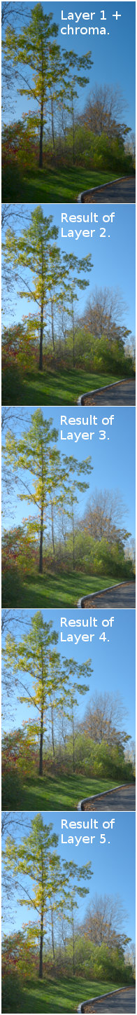
The LCh Lightness, Chroma, and Hue Layer groups. The Layer groups are set, respectively, to the LCH Lightness, Chroma, and Hue blend modes. - Make three additional copies of the scene-referred layer and put one copy inside each layer group, as shown below:

Setting up the Lightness, Chroma, and Hue Layer groups Initially each Layer group contains a single copy of the scene-referred layer (the "before" image), just as it was output by the raw processor.
The copies of the original scene-referred layer that are inside the Chroma, Lightness, and Hue Layer groups should be set to Normal blend mode.
The three copies of the scene-referred image form the bottom of the Hue, Lightness, and Chroma Layer stacks and are never actually edited, except that as explained below, when we get to the Lightness group, we'll desaturate the scene-referred layer to Luminance.
The resulting image still looks just like the "before" image, because we haven't done any editing yet. The first actual editing step will be to make a layer for controlling Chroma:
Edit for Chroma
To anyone who tried to follow this tutorial before I updated it, my apologies! The original tutorial from 2015 was tested by a very kind proofreader who successfully worked through each step and really liked the procedure. I use variations of this procedure all the time, not just for photographic editing but also for painting. I think the techniques are well worth learning, but this isn't possible when the steps can't be followed!
Originally the Chroma layer mask was made using a combination of the LAB "B" channel and the LCH "C" channel, obtained by using "Colors/Decompose". Trying to rewrite this tutorial several months ago I had switched to "Colors/Extract Components", but currently (and maybe always?) default GIMP 2.10's "Colors/Extract Components" operation clips any out of gamut values in the LCH "C" channel, rendering this operation unuseable for making a Chroma mask for a layer with very high Chroma values. The rewritten steps below use "Colors/Decompose" to LCH, and don't use the LAB "B" channel at all.
OK, getting back to the actual tutorial, the Chroma Layer group should be set to the LCH Chroma blend mode. The layers inside the LCH Chroma Layer group should be set to the Normal blend mode.
The original scene-referred image needs a chroma boost. So working in the Chroma Layer group:
- Make a copy of the scene-referred layer ("Make New from Visible", or just duplicate the scene-referred layer) and make sure the layer blend mode is set to Normal. Change the layer name to "Visible + Channel Mixer".
- Select the "Visible + Channel mixer to add Chroma" layer. Then do "Colors/Components/Channel Mixer" and change the channel settings as follows:
- Red channel: 2.000 / -0.500 / -0.500
- Green channel: -0.500 / 2.000 / -0.500
- Blue channel: -0.500 / -0.500 / 2.000
- Make and add a "Chroma mask" to the "Visible + Channel mixer to add Chroma" layer:
- Select the "Visible + Channel mixer to add Chroma" layer
- Do "Colors/Components/Decompose" and select the "Color model: LCH" option. Make sure "Decompose to Layers" is selected.
- Switch to the resulting grayscale layer stack. This grayscale layer stack is at 32-bit floating point "Linear light" precision. Unfortunately the layers in the decomposed to LCH layer stack don't have the correct tonality. To restore the correct tonality, first go to "Image/Precision" and change the precision of the grayscale layer stack to "Perceptual gamma (sRGB)". Then download and assign the profile Gray-elle-V4-labl.icc to the layer stack.
- To make the actual "Chroma mask", hide the "L" channel and select the "C" layer. Change the "C" layer name to "Chroma mask" and then do "Colors/Invert".
- Drag the "Chroma mask" layer back to the original RGB layer stack. Feel free to delete the LCH grayscale layer stack as it won't be used again in this tutorial. (As an aside, the "L" channel can be used in combination with the "C" channel to make a "Colorfulness" mask, which is often more useful than a "Chroma" mask, but that is a topic for another tutorial).
- Then right-click on the newly-added "Chroma mask" layer and select "Layer/Mask/Add Layer Mask" and then select "Grayscale copy of layer". Then load the newly-added layer mask as a selection by right-clicking on the layer mask and selecting "Mask to Selection".
- Make the "Chroma mask" layer invisible and add the selection as a layer mask to the original "Visible + Channel mixer to add Chroma" layer. Then dismiss the selection. Feel free to delete the "Chroma mask" layer as it won't be used again in this tutorial.
- Click on the newly added "Channel Mixer" layer mask and adjust the tonal range using "Colors/Levels" by moving the right Output sliders to "76" as shown in the screenshot — this step just further limits the amount of Chroma added by the initial Chroma mask:

Having added ridiculous amounts of saturation using the Channel Mixer, the next step is to select the "Channel Mixer" layer and decompose to LCH. 
Making a "Chroma mask" from the LCH "C" layer. 
Levels adjustment for the Chroma mask. 
After adding the Chroma mask to the Channel Mixer layer.


The "Visible + Channel mixer to add Chroma" layer will get a whole lot more colorful. It will hurt your eyes. It might burn a hole in your screen. But don't worry, we'll tame all that excessive saturation with a "Chroma" layer mask.
And that's it. The Chroma edits pretty much have all been made. However, once changes are made in the Lightness blend group, the Chroma mask will need to be further modified to lower the Chroma in the brighter, lower left portion of the sky. Otherwise these colors will be driven out of gamut — the Blue channel values will be greater than 1.0f. As you can see from the screenshot, I added Sample Points to the image to allow monitoring sky colors.
Generally speaking, as you work in the Lightness Layer group you'll also be tweaking the masked layer in the Chroma Layer group. This is because although LCH Chroma is independent of Lightness, the appearance of Colorfulness is not. And the usual goal when editing a scene-referred image is to increase Colorfulness, not Chroma.
 Tweaking the mask for the "Add Chroma" layer is a pretty important part of editing Lightness, Chroma, and Hue in separate Layer groups. If you don't have a clear idea of which image colors you might want to make more colorful in your final image, start with a mask filled with 50% LAB L gray, which is the same as 18% gray in a linear gamma RGB color space, or R=G=B=47 using GIMP's RGB color sliders (47 divided by 255 is 0.18).
Remember these values for future reference because it's pretty handy to know that 50% LAB gray is equal to 18% RGB gray (more precisely, 18.4187% gray). Making a 50% LAB gray mask is easy — In the "Change Foreground Color dialog, set the "L" (Lightness) slider to 50 and the "C" (Chroma) slider to 0. It doesn't matter what the "H" (Hue) slider is set to.
Edit for Lightness
Notes on GIMP 2.10 Curves and Levels dialogs and Layer blend modes
Some of the steps in this tutorial use Curves. For radiometrically correct editing (that is, to avoid "gamma" artifacts), Curves and Levels must be done using linear RGB. This wasn't possible in default GIMP 2.9. But it's possible and easy in GIMP 2.10, just by clicking on the "Adjust Curves/Levels in linear light" button near the top of the Curves and Levels dialogs. Sometimes, and especially when working on layer masks, you get to your desired result faster by operating on perceptually encoded RGB. And sometimes there are good artistic reasons to operate on perceptually encoded RGB. But as a general rule and to avoid gamma artifacts, try linear RGB first.

Also radiometrically correct editing requires that Normal blend mode be done using linearized RGB. In GIMP 2.10, by default Normal blend mode always uses linearized RGB regardless of whether the image precision is "Linear light" or "Perceptual". There is an override available either by using "legacy" blend in the layer blend dialog, or by right-clicking on the layer itself and changing the default compositing and/or blending color spaces. There will almost never be any reason for most people to ever want or need to override the default compositing/blending color spaces except to emulate GIMP 2.8 layer blending. But the option is there for advanced or artistic use cases.
Please note that in earlier versions of GIMP 2.9 (for example 2.9.5), whether layers blended using linear RGB or else using perceptually uniform RGB depended on the image precision ("Image/Precision" followed by selecting "Linear light" or "Perceptual (sRGB)"). This is no longer the case for GIMP 2.10! In GIMP 2.10, regardless of the image precision, layer blend and compositing modes are determined by hard-coded defaults that vary from one layer blend mode to the next. For example, Multiply, Addition, Divide, Subtract and Normal blend all default to "linear" blending and compositing. But Soft Light and similar blend modes default to "perceptual" blending (and I think compositing, but I'm not sure). This change in how blend modes operate also also applies to painting, smudging, etc using blend modes.
Working in the Lightness Layer group
OK, returning to the actual tutorial, the Lightness Layer group should be set to the LCH Lightness blend mode. Usually the layers inside the LCH Lightness Layer group should be set to the Normal blend mode. But you can also use other blend modes that modify tonality, right inside the LCH Lightness Layer group, for example using Soft light blend when doing High Pass sharpening. (If you are new to high bit depth GIMP, the high pass filter is found under "Filters/Enhance".)

The Chroma Layer group only required two layers, and one of them was just the scene-referred layer that wasn't (and shouldn't be) edited. The Lightness Layer group requires five layers, again including the unedited scene-referred layer at the bottom of the layer stack. All the layers in the Lightness Layer group are set to Normal blend except for the High Pass sharpening layer, which is set to Soft light blend mode:
- Exactly as with the Chroma Layer group, Layer 1 (the bottom layer) is a copy of the original scene-referred image. The only difference is that I desaturated the layer to Luminance ("Colors/Desaturate/Luminance"), for reasons explained in C3 below.
For those of you who just can't get enough of color science ☺ , RGB Luminance has the exact same tonality as LAB/LCH Lightness, which has the exact same tonality as the "Y" component of XYZ — the only difference is the color space used to express that tonality.
- Layer 2,"Positive exposure compensation +0.34", uses "Colors/Exposure" to add +0.34 stops of exposure compensation to a copy of Layer 1. This brightens the copy of Layer 1 as much as possible without clipping any channel values.
- Layer 3 is a copy of Layer 2, to which a Curves adjustment was applied to further brighten the entire image, using the "sky.curves". A layer mask is used to avoid blowing out the brightest portions of the sky. After establishing the brightness of the sky, the trees and ground were still too dark to suit my previsualization of the final image (though sometimes I think stopping right here might not be such a bad idea).
- Layer 4, "Curves for ground", establishes the tonality of the trees and ground. This layer was was made using "Layer/New from Visible" and then desaturating the resulting layer to Luminance. Then a Curves adjustment was applied to raise the Lightness of the trees and ground, using the "ground.curves" preset. Layer 4 was masked to allow a small amount of further sky brightening, but not, of course, in the lower left corner of the sky.
- Layer 5, "High pass 2.00/0.5, Soft light blend" is made by first using "Layer/New from Visible" and then desaturating the resulting layer to Luminance. Then use GIMP's High Pass filter ("Filters/Enhance/High Pass") to add a small amount of sharpening/local contrast to the image, setting the Std. Dev to 2.00 and the Contrast to 0.5. The layer masks keeps the filter from affecting the sky areas.
And now all the Lightness edits have all been made. It will be much easier to make and modify the Lightness edits when the happy day arrives that GIMP provides Adjustments Layers. But one step at a time, GIMP is already amazing.
Why I desaturated all the layers in the Lightness Layer group
The only editing operations I used in the Lightness Layer group were Exposure, Curves, and High Pass Sharpening. At floating point precision, Exposure, High Pass Sharpening, Channel Mixer and "Colors/Desaturate/Luminance" do not clip out of gamut RGB channel values. Also the Normal, Lightness, Chroma, and Hue modes do not clip out of gamut channel values. (To reiterate, if you are operating at integer precision instead of floating point, all editing operations clip.)
However, even in high bit depth GIMP and even at floating point precision, Curves clips out of gamut channel values (for Curves to *not* clip we'd need user-programmable parametric curves, which would be nice but also would limit the Curve shapes you could make). So I was careful to bend the Curves at the top to avoid blowing out highlights. And I also took the precaution of desaturating to Luminance each "Make New from Visible" layer ("Colors/Desaturate/Luminance") in the Lightness Layer group before applying that Layer's editing operation.
Desaturating each "Make New from Visible" layer in the Lightness layer group as a way to mitigate clipping might seem like an odd move. But consider that to make color, the RGB channel values are not equal. The more colorful a color is, the farther apart the RGB channel values must be. The combined Chroma and Lightness Layer groups added a fairly significant amount of colorfulness to the Early autumn colors image, which in fact did drive some of the more colorful regions of the image beyond the limits of the sRGB color gamut. Desaturating each layer of the Lightness Layer group before performing the next edit significantly reduces the potential for clipping colors along the way.
Before the final image can be exported to disk for printing or for display on the web, the out of gamut colors must be dealt with one way or another. But allowing those colors to "clip along the way" produces uncontrolled Lightness, Hue and Chroma shifts. In high bit depth GIMP, keeping the colors unclipped until the output/soft proofing stage of your workflow allows you, as the artist and photographer, to choose when and how to deal with out of gamut colors.
Edit for Hue
The Hue Layer group should be set to the LCH Hue blend mode. The layers inside the LCH Hue Layer group should be set to the Normal blend mode.
Reasons for modifying hues
On the one hand, if you are color-correcting an image that was previously mangled by someone else's editing, or by the camera itself when shooting jpegs, or by a raw processor that insists on "prettifying" your image for you, then control over hues is a critically important skill.
On the other hand, making hue adjustments is pretty much purely an artistic decision when you:
- Shoot raw and use a properly made camera input profile that doesn't deliberately mangle Hue and Chroma (the old Adobe matrix profiles produced oddly desaturated colors, and the new DCP profiles are designed to emulate various camera picture styles, which means bending Hue and Chroma in service of the camera manufacturers' idea of "pretty", which might or might not cohere with your own artistic intentions).
- Start with scene-referred output from a raw processor that didn't mangle your RGB values.
- Edit separately for Lightness and Chroma, using floating point precision and taking care not to clip interim RGB values.
Either way — color correction or artistic intent — I think you'll really like the fact that GIMP's LCH blend modes allow you to put your edits for hue in a separate LCH Hue Layer group, and edit for Hue without also affecting Chroma and Lightness:
Using the Hue-Chroma tool to modify LCH Hues without modifying Lightness or Chroma
In my opinion the Early autumn colors image doesn't require any hue alterations even for artistic purposes. But Figure 7 shows the results of two different hue modifications. Below on the left, I moved just the sky hues clockwise by five degrees, clockwise towards green (in nature "blue sky" hues range from purple-blue to green-blue). Below on the right, I left the sky alone and moved just the tree and ground hues clockwise by five degrees (as autumn progresses, autumn colors get warmer):

- On the left, the sky hues were moved five degrees clockwise (towards the greener side of blue), and the hues in the trees and ground were left untouched.
- On the right, the hues in the trees and ground were moved five degrees clockwise (so all the yellows and greens are slightly warmer in hue), and the sky was left untouched.
Before exporting the final image to disk I made the Hue Layer group invisible. It's only here to show you how to control Hue separately from Lightness and Chroma, which you will find very useful as you start incorporating LCH into your workflow.
To move the hues around I used the Hue-Chroma tool, which produces color-space-independent editing results.
Figure 8 below shows you how to use LCH Hue layer group to move the sky hues five degrees clockwise towards green:

To move the sky hues five degrees towards green:
- Make a copy of the scene-referred layer, keeping the blend mode at Normal blend, and change the Layer name appropriately.
- Select the relabelled layer (the screenshot shows the Layer group still selected, my apologies!). Then use the "Select by Color Tool" to select the blue sky.
- Then open the Hue-Chroma dialog ("Colors/Hue-Chroma") and move the Hue slider to -5 degrees, which moves the hues in the selected area 5 degrees clockwise, thus making the sky slightly more on the green side of blue. (My apologies, the Hue-Chroma tool really should move clockwise using positive rather than negative hue slider adjustments.)
Still keeping just the sky selected and moving the Hue slider to +5 degrees would make the sky more purple.
If you select the entire image (which is the same as not making any selection at all) and apply a -5 degrees Hue slider adjustment, the sky will move towards green, the green grass will move closer to the yellow side of green, the yellow leaves will move closer to orange, the reds will move towards purple, and so forth.
For the rest of this tutorial, the Hue Layer group plays no further role and so was removed from the Layer stack.
Out of gamut colors: Why they are important and how to deal with them
If you want to take full advantage of everything high bit depth GIMP has to offer for image editing, you need to learn about out of gamut colors and how to deal with them.
To clip (use integer precision) or not to clip (use floating point precision)
 As previously noted, out of gamut colors have at least one RGB channel value that is either less than 0.0f or greater than 1.0f. As I edited the Early autumn colors image, I use the Color Picker along with the Sample Points and Pointer dialogs to monitor for out of gamut colors. As you can see by the screenshot to the right, all four Sample Points are placed on colors that are out of gamut.
So the next question is where did these out of gamut colors come from? The original dark, flat, scene-referred image didn't have any out of gamut colors.
The answer, again as already noted, is that if you are editing at floating point precision using high bit depth GIMP, then many editing operations don't clip the out of gamut colors that are produced along the way. I've already listed a few such algorithms. Another such operation worth noting is that converting from larger to smaller RGB working spaces at floating point precision doesn't clip out of gamut colors.
On the one hand, out of gamut colors are very useful because they allow you to recover and work with color data that would otherwise be lost to clipping. On the other hand, out of gamut colors can produce a whole lot of headaches while editing.
Fortuately with high bit depth GIMP you have a choice: you can edit at floating point and take advantage of the out of gamut colors. Or you can editing at integer precision, in which case the out of gamut colors are automatically clipped.
Automatic clipping of out of gamut RGB channel values that would otherwise be generated by various editing operations produces two distinct editing problems:
- Irretrievable loss of detail that could otherwise be recovered by bringing the out of gamut colors back into gamut:
Sample Point 4 has a channel value that's greater than 1.0f in the blue channel, which naturally is the dominant channel for blue colors. Some of the yellows also have green and/or red channel values greater than 1.0 (green and red are the dominant channels for yellow), and if those areas had been clipped by the Channel Mixer operation, the affected areas would have had visible areas of lost details.
- Hue shifts:
Sample Points 1, 2, and 3 have negative channel values, but obviously not in the dominant color channel(s). Clipping a negative channel value is sometimes OK, and sometimes produces a visually obvious problem:
If the Red channel in Sample Point 1 had been clipped by the Channel Mixer operation, that would have pushed the blue sky color towards purple. This is because clipping a negative Red channel value to 0 is mathematically exactly the same as adding red to blue, which explains why adding saturation using Channel Mixer at integer precision (which clips out of gamut RGB values) can instantly turn blue skies to purple.
Clipping negative values in the Blue channel is like adding blue to a color. Adding blue to yellow or orange foliage usually passes without notice — the resulting color is less saturated but if the green and red channels are more or less equal, there's not much hue shift.
I suspect that most people are probably more sensitive regarding overly purple (or green) skies, than they are to shifts in the saturation and hues of fall foliage.
Being able to work with the out of gamut channel values is very useful because you have a chance to make deliberate changes at any point in the worflow, right up to the point where you export the images to disk for printing or display on the web.
But you do need to monitor and eventually deal with out of gamut RGB channel values. As soon as you output the image in a file format that doesn't support floating point RGB values (eg jpegs, pngs, and integer precision tiffs), any out of gamut channel values in the final image are immediately clipped.
Editing at floating point requires soft proofing before exporting the final image to disk
So when you've finished editing your image, what can you do to bring any remaining out of gamut colors into gamut with respect to your chosen output color space? This is where standard soft proofing techniques come into play:
- You can decrease Chroma and/or Lightness, either locally or globally.
It seems to me that digital photographers (including me) tend to make images too bright and too colorful. Proofing each image you work on to a wide gamut printer profile is good discipline, even if you have no intention of actually having a paper print made.
GIMP uses LCMS for ICC profile color space conversions, and as of LCMS V2.7 there are a couple of bugs in the LCMS algorithm for soft proofing:
- The gamut checks don't give accurate results for linear gamma images, so for accurate soft proofing you need to make a flattened copy of the final image and convert it to to a color space with a perceptually uniform TRC.
- The soft proofing algorithm doesn't seem to account for out of gamut RGB values. So to have a more realistic idea of what the output image will look like, duplicate the flattened copy and apply a "NULL" Curves correction (that is, select the duplicate layer, open the Curves dialog and then click OK, without actually moving any points on the Curve — don't ever do this accidentally, as it will immediately clip any out of gamut RGB values!).
- You can deliberately change the Hues of out of gamut colors, which sometimes help to move them inside (or closer to) the color gamut of your chosen output color space.
- Often simply letting some or all of the remaining out of gamut colors in the final image clip is the easiest and most aesthetically pleasing thing you can do.
- If the output color space is a printer profile, if relative colorimetric intent clips too many colors, you can try perceptual intent. These days the wider gamut printers have pretty large color gamuts. But the same is not true of printing processes for mass reproduction.
- For images posted to the web, if your audience is composed strictly of people who are likely to use properly color-managed browsers and wide gamut monitors, you can output to a larger color space such as AdobeRGB1998. But sRGB is still the safest bet for the web.
Oh, and in case you are wondering, I did my best to avoid out of gamut colors in the final Early autumn colors by using the Chroma mask to bring out of gamut colors back into gamut, focusing mostly on the colors with negative channel values. But in the final sRGB image for display on the web, I allowed the brighter blues in the sky to clip to 1.0 in the blue channel, and also allowed some of the orange leaves to clip to 1.0 in the yellow channel. So upon export to disk for display on the web, the output hues for these colors did shift. In particular, the blue in the lower right corner of the sky shifted from 254 degrees before clipping, to 242 degrees after clipping, and the Chroma dropped from 27% to 22%. Bringing these blue and orange colors into gamut without clipping and the consequent LCh hue changes would require decreasing the Lightness and/or the Chroma, and I decided that for outputting to disk and subsequent display on the web, maintaining colorfulness/saturation in the orange leaves and blue sky was more important than maintaining hue.